Have Digital Marketers Lost Their Creativity?
Earlier this year, freelance web designer Dave Ellis (based in West Yorkshire, England) noted a similarity with many of today’s websites: they all look similar. Strikingly similar. He created a generic, wireframe template (pictured below) that anyone in the marketing industry would recognize. I’m sure some of us are even guilty of creating this same layout for client sites. The post went viral, and many accused web designers of copycatting.
I have no doubt you’ve also seen a website that looks exactly like the template below. You’ll even notice elements from that template on Salty Key, even though I built this site from scratch. So what gives? Are we all just imitating each other?
I will argue that a number of factors have led us to “design convergence” and created an entire galaxy of clone websites. Are some designers just lazy? You bet. But if we begin to address the circumstances that got us into this mess, maybe it’ll lead to more imaginative web design in the future.
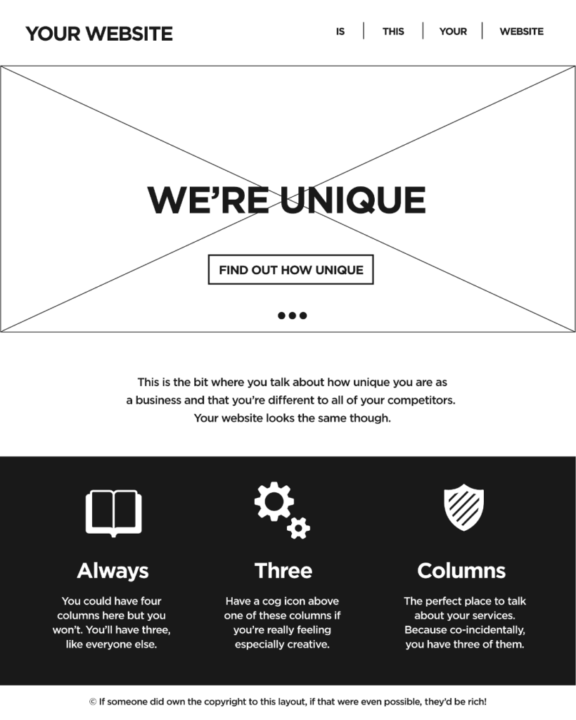
Image credit: Dave Ellis, NoVolume
“Mobile-first” design limits the scope of design options
Before I go any further, a disclaimer: it is possible to produce responsive websites that break the mold of your typical design layout (i.e. hero image + three-column layout). That said, it’s difficult to produce an original-looking site that functions well AND scales gracefully across all screens and devices. The full-screen images and column layouts collapse nicely and look good on desktops, tablets, and phones. That’s why so many developers are stuck to that design.
At this point, it’s a given that mobile-friendliness needs to be the first priority for a new site or site redesign. Mobile usability has been a ranking factor since 2015, and Google rolled out a second mobile-friendly algorithm in May. Mobile internet usage has also surpassed non-mobile usage in regards to mobile-only vs. desktop-only internet usage, total search queries, and time spent consuming digital media.
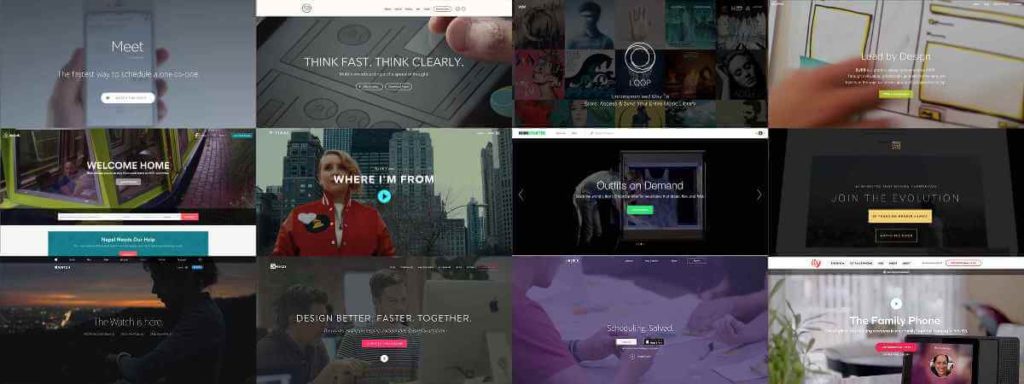
(Image Credit: Louder Than Ten)
So we know that mobile-friendliness is important, but why are developers putting out the same designs? I have three hypotheses:
- A lack of technical skill. “Web developer” and “Web designer” are not synonyms; developers have coding expertise that many designers don’t. A designer may be able to visualize a truly original mobile design in their mind, but unable to translate that into valid code. On the flip side, a developer may have the coding ability but lack the creative talent of a designer. The typical, run-of-the-mill design you see above is easy: it’s easy to design for and it’s easy to code, which helps both developers with no artistic ability and designers with limited coding knowledge.
- Many template authors use the same design. If you visit any of the sites that sell stock templates, you’ll notice most of the themes are just reiterations of each other. They may sell one “design” to an accounting firm, and then swap out all of the stock photos of balance sheets with bulldozers and sell that same design to a construction company. The structure is still the same. Few sites on the web are custom coded. Templates are quicker (and usually cheaper) to get up and running. That and most designers are more comfortable working with a template than coding from scratch.
- Agencies and designers/developers prefer easy. As mentioned, this layout is easy to design and build. Frameworks like Bootstrap and Foundation make it even easier. Agencies are fast-paced and time-sensitive, so most account executives want fast turnover rather than groundbreaking design. Not always, but time is money for agencies. Many web agencies will build their own skeleton template that serves as a blueprint for each client site. These skeleton themes are reused from project to project. Without boring you with the details, there’s a lot of technical work that needs to be done before you get to the fun stuff. Using skeleton themes (or starter themes) saves you the hassle — and cuts your development in half. Remember, time is money for agencies, and budgets are tighter than ever. To borrow an old expression, “Why reinvent the wheel when you don’t have to (and doing so puts you behind schedule)?”
So we’ve uncovered some of the reasons for “website convergence,” but not every reason points to laziness.
There’s a reason this layout dominates the market. It’s a good design. It’s well suited for mobile devices. It works well across devices, browsers, and aspect ratios. It’s easy for users to navigate. And it’s trendy. Don’t underestimate trendiness. Clean, modern-looking (or ultra minimalistic) design is in vogue right now. Think high-end fashion magazines: light backgrounds, big text, and full-width glamour images. You wouldn’t believe how many clients will look at a competitor website they like and say, “I want that one!”
Trends come and go, but this is one of the better trends. Another trend that needs to die that’s ubiquitous on the web is the full-screen intro pages. Everyone jumped on that bandwagon, even Salty Key. (See the old Moirai Orthopaedics site above.) The single-page scrolling trend has also fizzled out due to SEO concerns; no matter how many keywords you throw on a page, a single page won’t rank for more than one or two keywords.
And we’re finally moving away from putting slider / carousel galleries on homepages. (Again, I’m guilty of this.) Sliders are slow-loading (most load their own CSS and JS files), bad for conversions (the CTR for most slider images is less than 1%), and most of the images used aren’t even relevant to the client. How many times have we scrambled to find slider pics because the client doesn’t have three or four quality images to put in there? Throwing stock photos in a client’s slider is pointless. This post from Yoast SEO explains it perfectly: sliders suck.